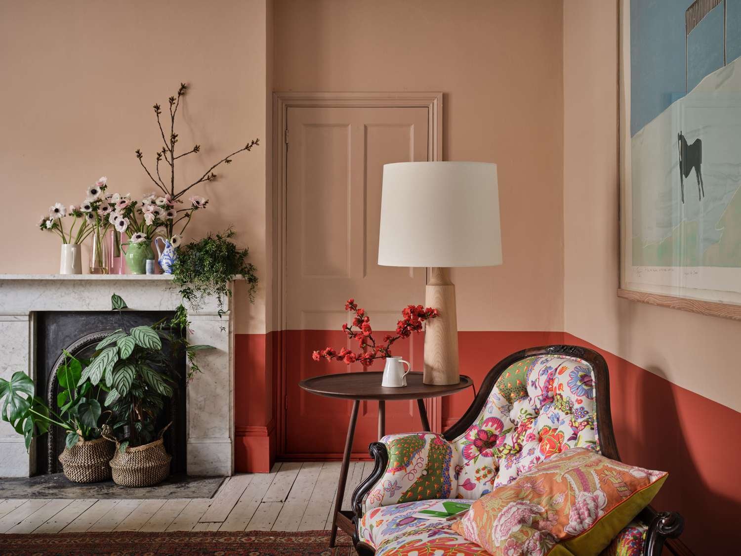
If you’re looking to add some color to your interior, a cheerful shade of coral is the perfect choice. Coral is a pinky-orange color named after the marine invertebrates that naturally adorn this striking hue. It is found in endless different shades and tones and can be more red-leaning, pink-leaning, or orange-leaning depending on your preferences.
Here are 20 of the best coral paint colors to cheer up any space.
-
01
of 20Benjamin Moore Coral Gables
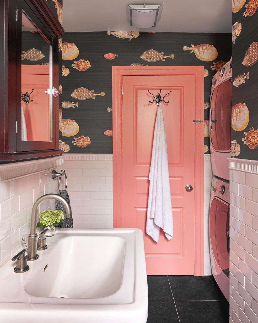
Credit: Design by Wills Design Associates / Photo by Studio Thanasis
Coral Gables by Benjamin Moore is a medium-toned, tropical-inspired shade that leans slightly more pink than orange. It’s ideal for adding a pop of color to any space and looks great when used on accent walls, or to highlight doors and trim alongside coordinating wallpaper, as seen in this bathroom design by Wills Design Associates.
-
02
of 20Benjamin Moore Georgia Peach
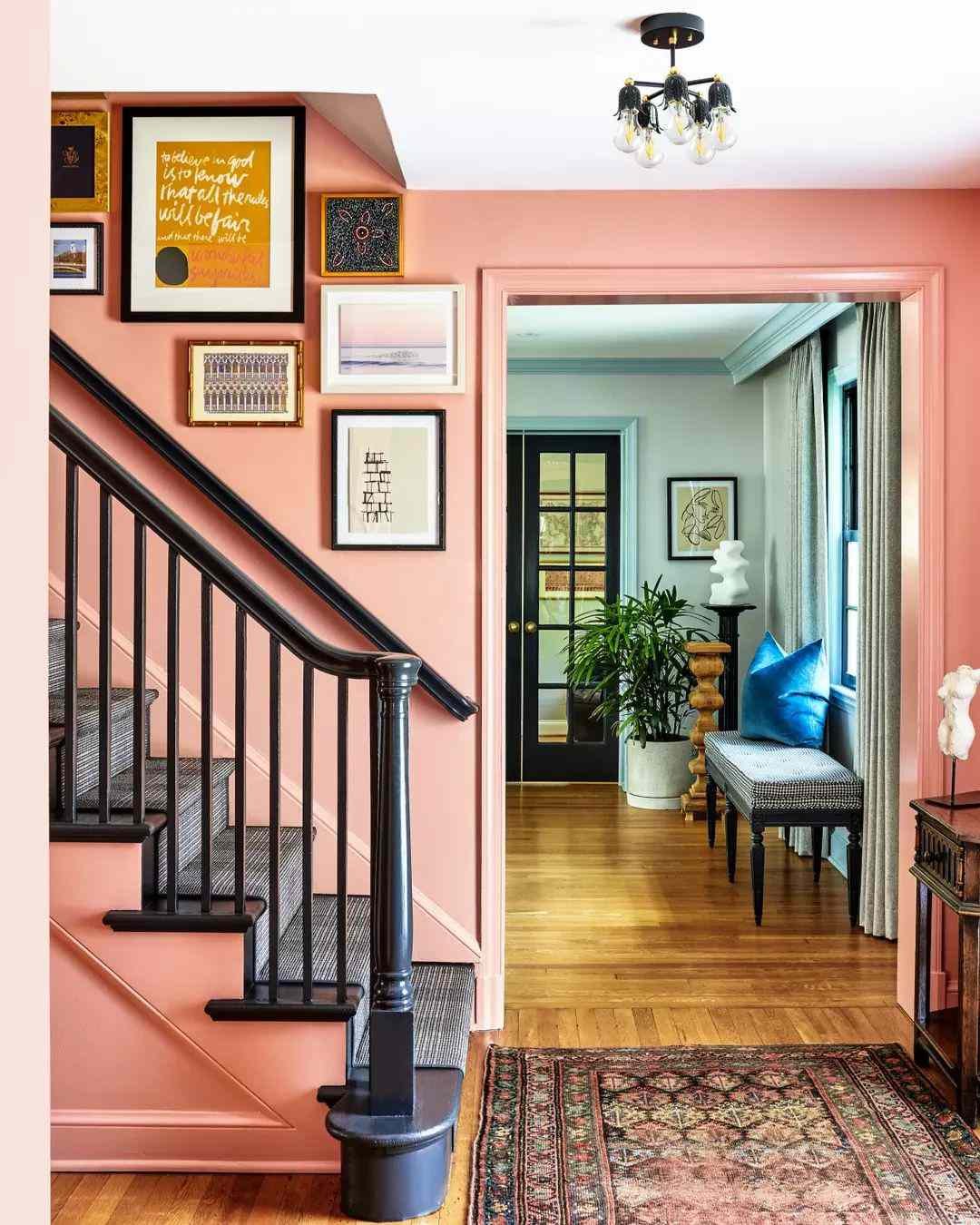
Credit: Zoe Feldman Design / Photo by Stacy Zarin Goldberg
This shade may be described as peach by Benjamin Moore, but it still falls within the coral family. It’s a light pinky-orange hue with cool undertones, offering a more subdued look than some of the punchier colors on this list.
That means it’s a great choice for color drenching, where it won’t threaten to be overwhelming. Alternatively, use it to add a pop of color in an otherwise neutral space.
-
03
of 20Backdrop 36 Hours In Marrakesh
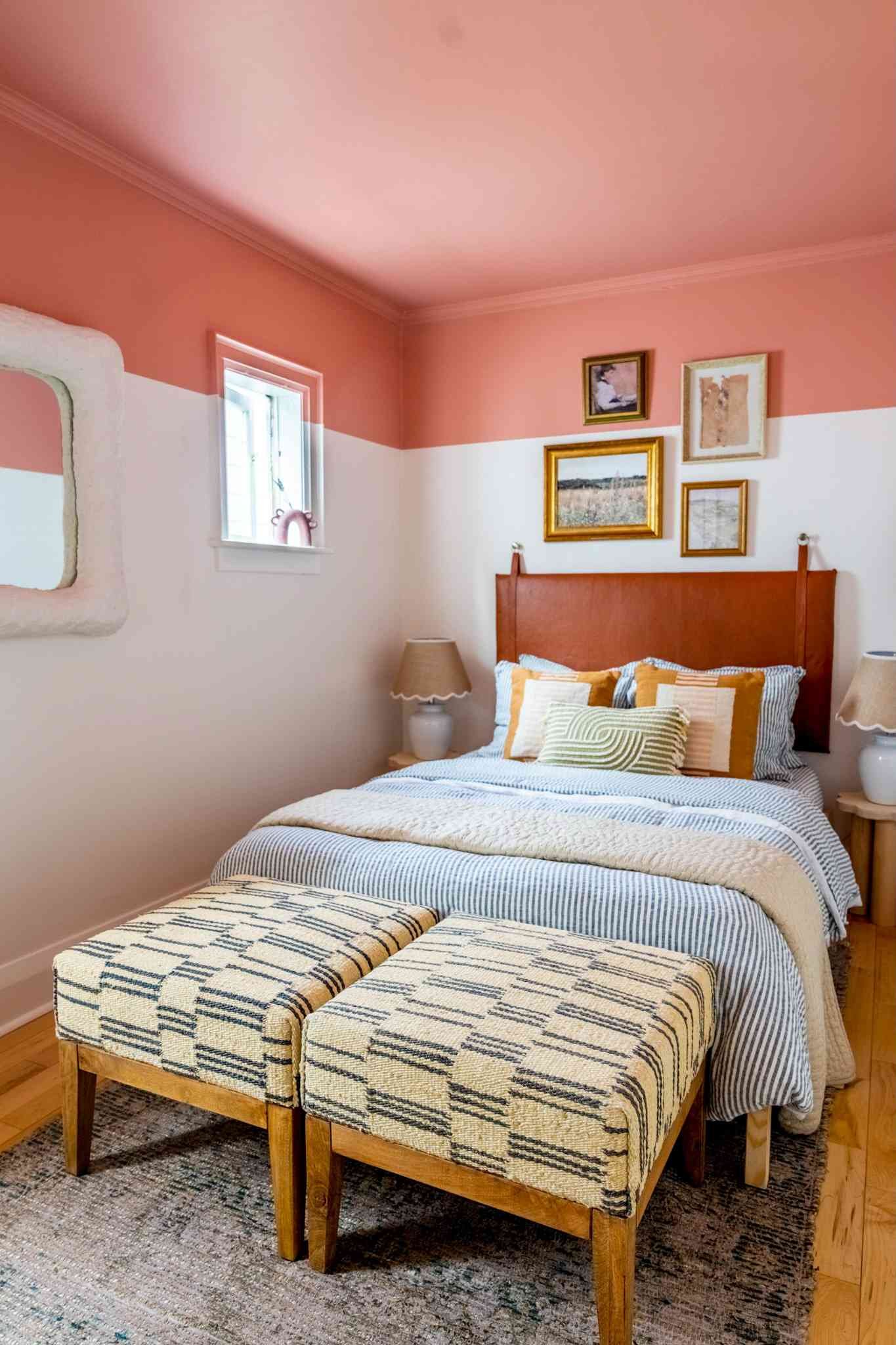
Credit: Design by Alexandra Gater / Carla Antonio Photography
This muted shade of coral is perfect for those looking for an earthier option. It has warm undertones and is predominantly pink with terracotta influences. Stylist and home decor expert Alexandra Gater used it to accent the top portion of this bedroom’s walls along with the ceiling for an eye-catching look.
-
04
of 20Farrow & Ball Red Earth
Credit:
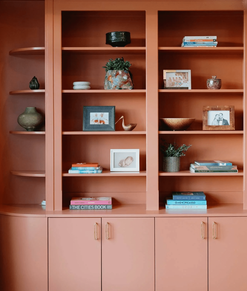
If earthy is your vibe, then you are going to love Red Earth by Farrow & Ball. This muted take on a coral shade is perfect for all kinds of applications, from accent walls to color drenched rooms and everything in between.
Farrow & Ball recommends using this mid-to-dark shade in smaller spaces, noting that it becomes warmer and more cozy as the sunlight changes throughout the day.
-
05
of 20Farrow & Ball Bamboozle

Credit:
Looking for something a little darker and moodier? Bamboozle by Farrow & Ball is a great choice. This fiery shade can be seen on the bottom portion of these living room walls. It is right on the edge of coral and red, but with its zesty orange and pink undertones, we’re going to count it.
-
06
of 20Sherwin Williams Rejuvenate
Credit: stylehomespace / Jason Donnelly
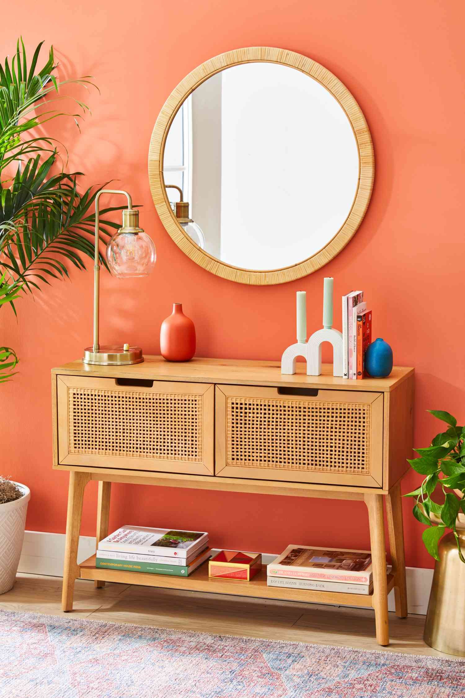
This medium-to-dark shade of coral by Sherwin Williams is full of energy and fun. It has orange undertones that give it a zesty feel. It’s the perfect accent color for furniture, doors, feature walls, and more. Or, go all out and paint your entire space—the choice is all yours.
-
07
of 20Benjamin Moore Geranium
Credit: Erika Bonnell Interiors / Photo by Stacy Zarin Goldberg
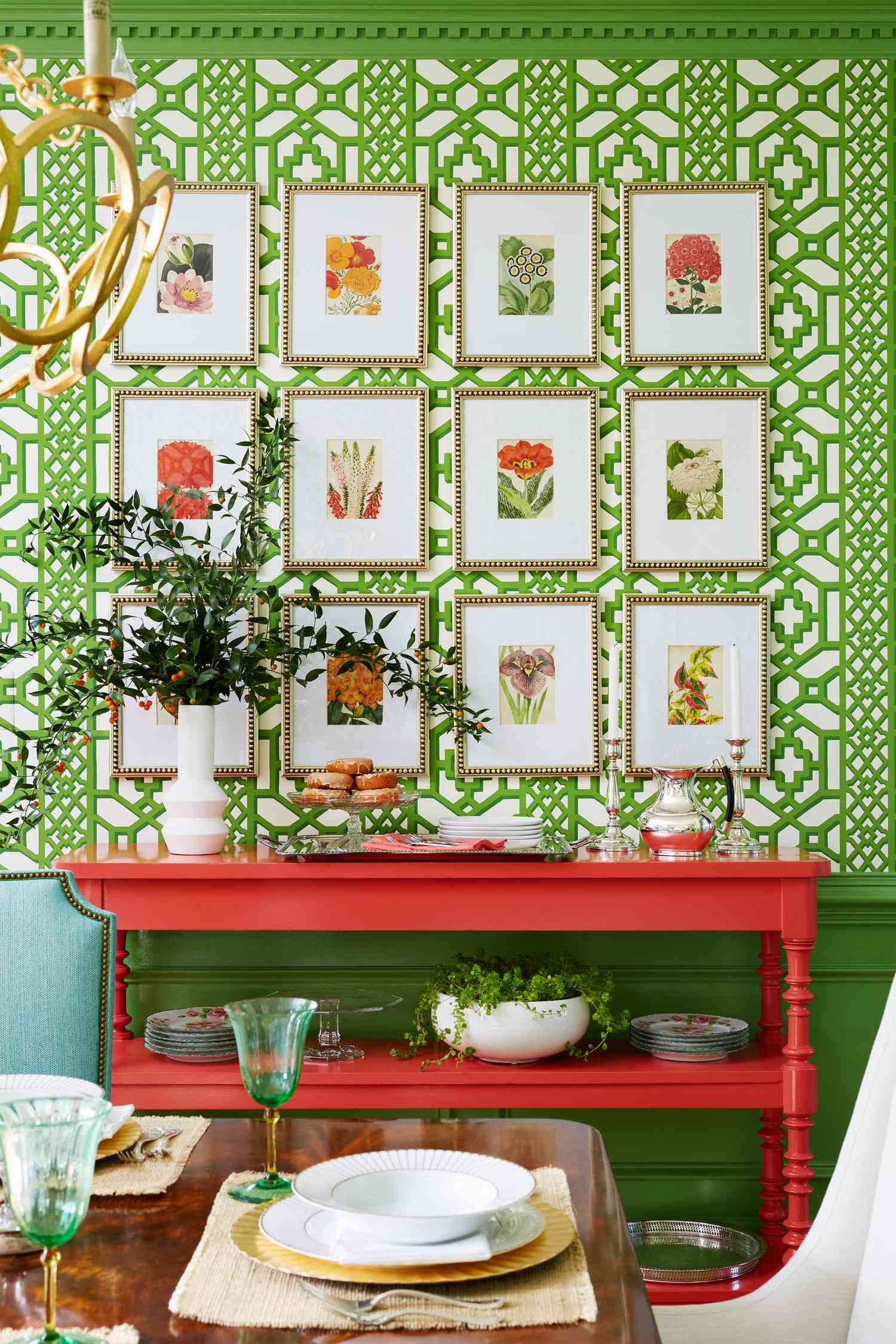
A deep, red-leaning shade of coral, Benjamin Moore’s Geranium is perfect if you want to add a lively pop of color to your space. If this bright hue feels too overwhelming for a full paint job, why not use it to give your favorite piece of furniture a new life? This console table was a family heirloom that was given a refresh by Erika Bonnell Interiors.
-
08
of 20Sherwin Williams Koral Kicks
Credit: @main_street_homes / Instagram
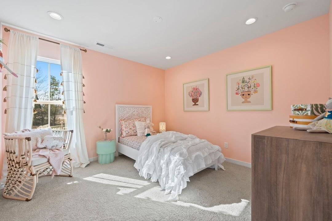
Are pastels your thing? If so, Koral Kicks by Sherwin Williams is a great choice. Perhaps the lightest shade of coral on this list, Koral Kicks is orange-leaning with pink undertones and a warm finish. This quaint shade looks elegant when paired with white and soft off-white shades but also looks great with contrasting colors such as turquoise.
-
09
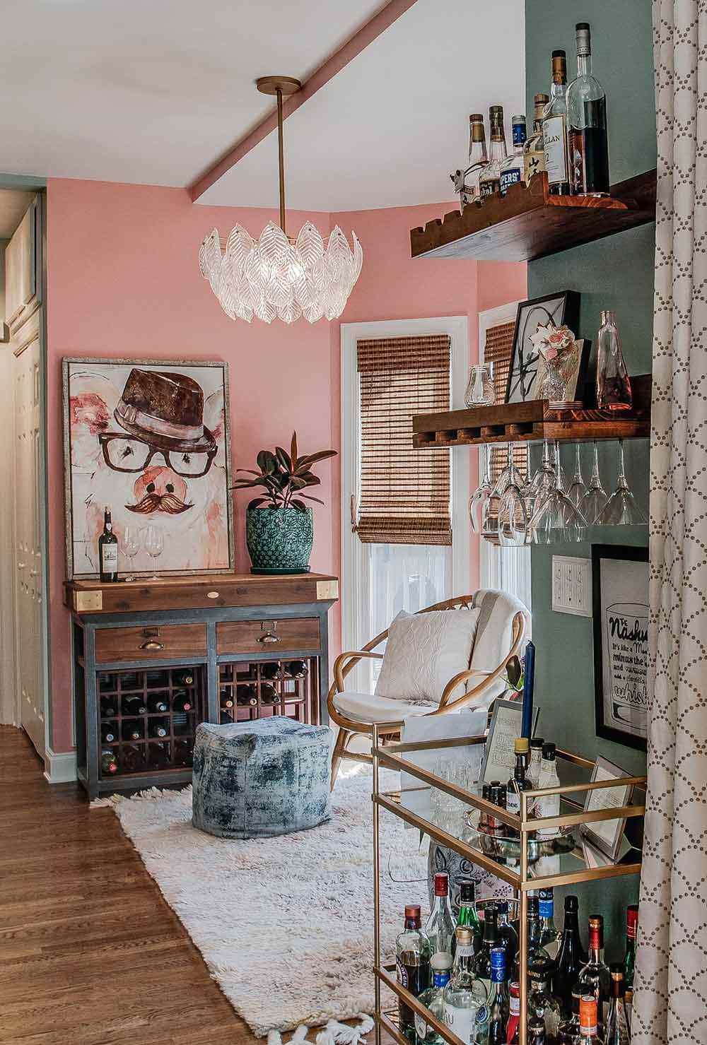
of 20Sherwin Williams Dishy Coral
Credit:
Dishy Coral by Sherwin Williams is a pink-leaning coral hue that’s perfect for those looking for a pink shade with a bit of an edge. This punchy color looks great when paired with contrasting colors like turquoise (as demonstrated in this sitting room by JL Design) but it would look equally as fun with coordinating pink or red shades.
-
10
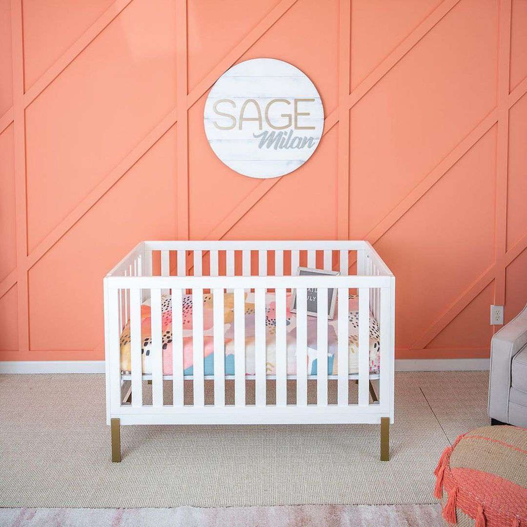
of 20Sherwin Williams Sockeye
Credit: @blessedlittlebungalow / Instagram
Sockeye by Sherwin Williams is a muted, medium-toned shade of coral with an earthy finish. It’s slightly more vibrant than other earthy shades on this list such as Coral Clay or 36 Hours in Marakesh. It is described as being in the orange color family with warm pink undertones.
-
11
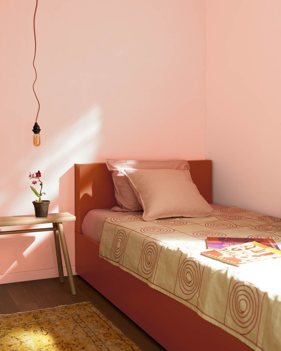
of 20Benjamin Moore Teacup Rose
Credit:
Benjamin Moore describes this shade as a “vibrant mixture of pink and coral,” which captures the color well. It could also be described as a light shade of salmon, with its pastel pink appearance and orange undertones. Teacup Rose offers a soft, charming appearance ideal for bedrooms, bathrooms, and more.
-
12
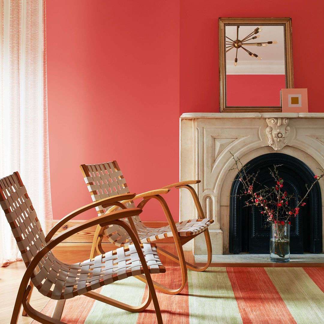
of 20Benjamin Moore Raspberry Blush
Credit:
In case you missed it, Raspberry Blush was Benjamin Moore’s 2023 color of the year. While 2023 may be behind us, our love for this electrifying pink-tinged coral hue certainly isn’t.
This bright and saturated shade of coral brings plenty of energy to any space. Use it as the primary wall color or take a more conservative approach by using it on an accent wall or to makeover your favorite piece of furniture.
-
13
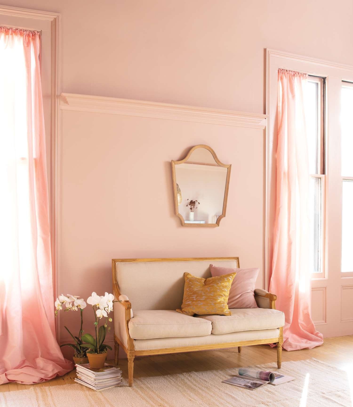
of 20Benjamin Moore Sunlit Coral
Credit:
This soft pastel shade is primarily pink with a delicate orange hue that lands it firmly in the coral camp. Thanks to its light hue, it looks great in a variety of different rooms, from bedrooms to bathrooms to living rooms and everything in between.
-
14
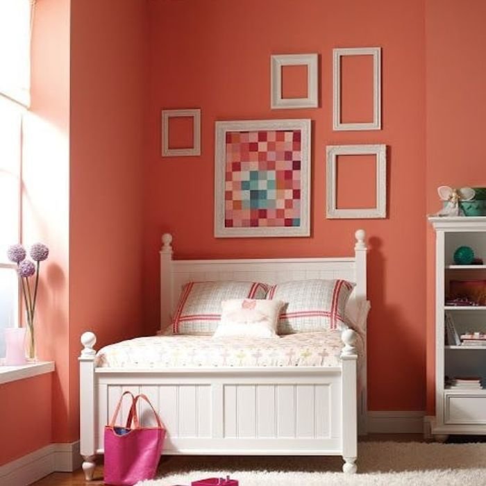
of 20Benjamin Moore Fan Coral
Credit:
A true coral shade, Fan Coral by Benjamin Moore is a medium-to-dark-toned color with orangey-red undertones. This bold shade can appear much darker in the absence of natural light, so be sure you test it in your space before committing to this vibrant coral color.
-
15
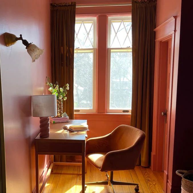
of 20Clare Pink Sky
Credit:
Clare’s Pink Sky is a medium-toned shade of coral with pink undertones. Just as its name implies, this pretty hue is inspired by the pinky hues that fill the sky during sunset. It’s not as bright as some of the other options on this list, which makes it ideal for more relaxed and soothing spaces.
-
16
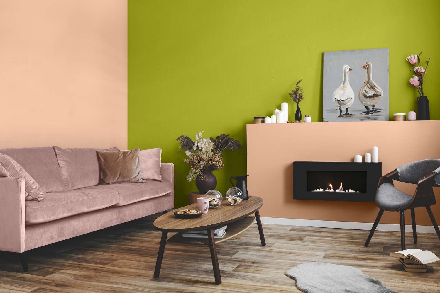
of 20Glidden Siesta
Credit:
Siesta by Glidden is a soft orange shade with strong pink undertones. Similar to Teacup Rose by Benjamin Moore, this shade could also be described as a part of the salmon family, although it’s far more orange-leaning than Teacup Rose. This pastel coral looks great in living rooms, bedrooms, bathrooms, and more.
-
17
of 20Glidden Coral Silk
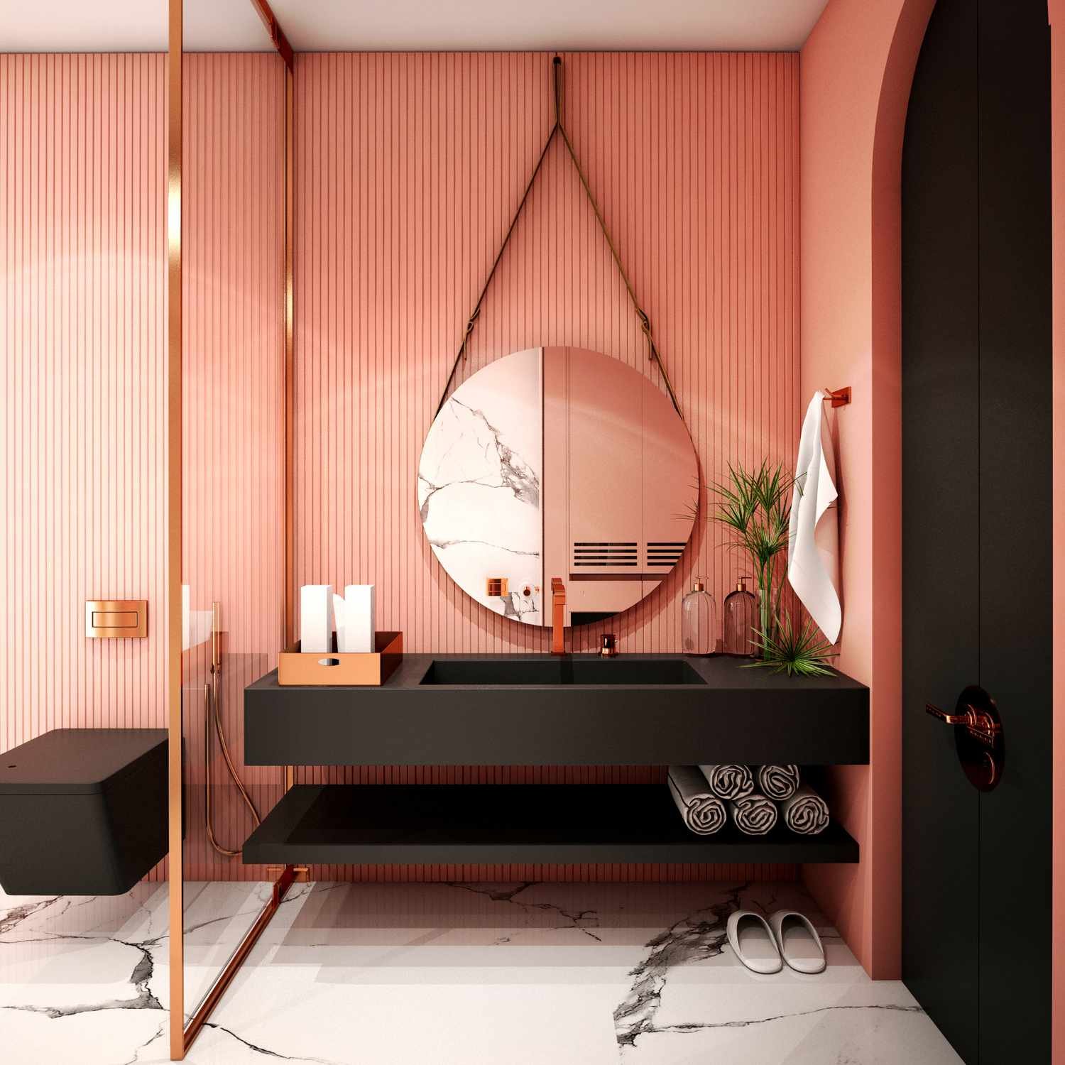
Credit:
This peachy coral shade by Glidden is perfect for any decor style. It’s light-to-medium in tone with soft pink undertones. Glidden describes it as a particularly good choice for coastal-inspired themes, but we love it for modern and eclectic looks too.
-
18
of 20Sherwin Williams Coral Clay
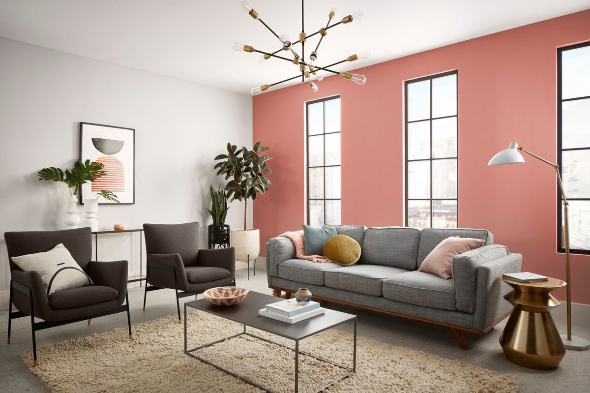
Credit: Sherwin Williams
Coral Clay is a muted, warm shade of coral with an earthy appearance. As the name implies, the color is reminiscent of natural pink or red clay, with a soft orange undertone. It pairs well with similarly muted and warm colors like off-white, cream, and mushroom.
-
19
of 20Sherwin Williams Coral Reef
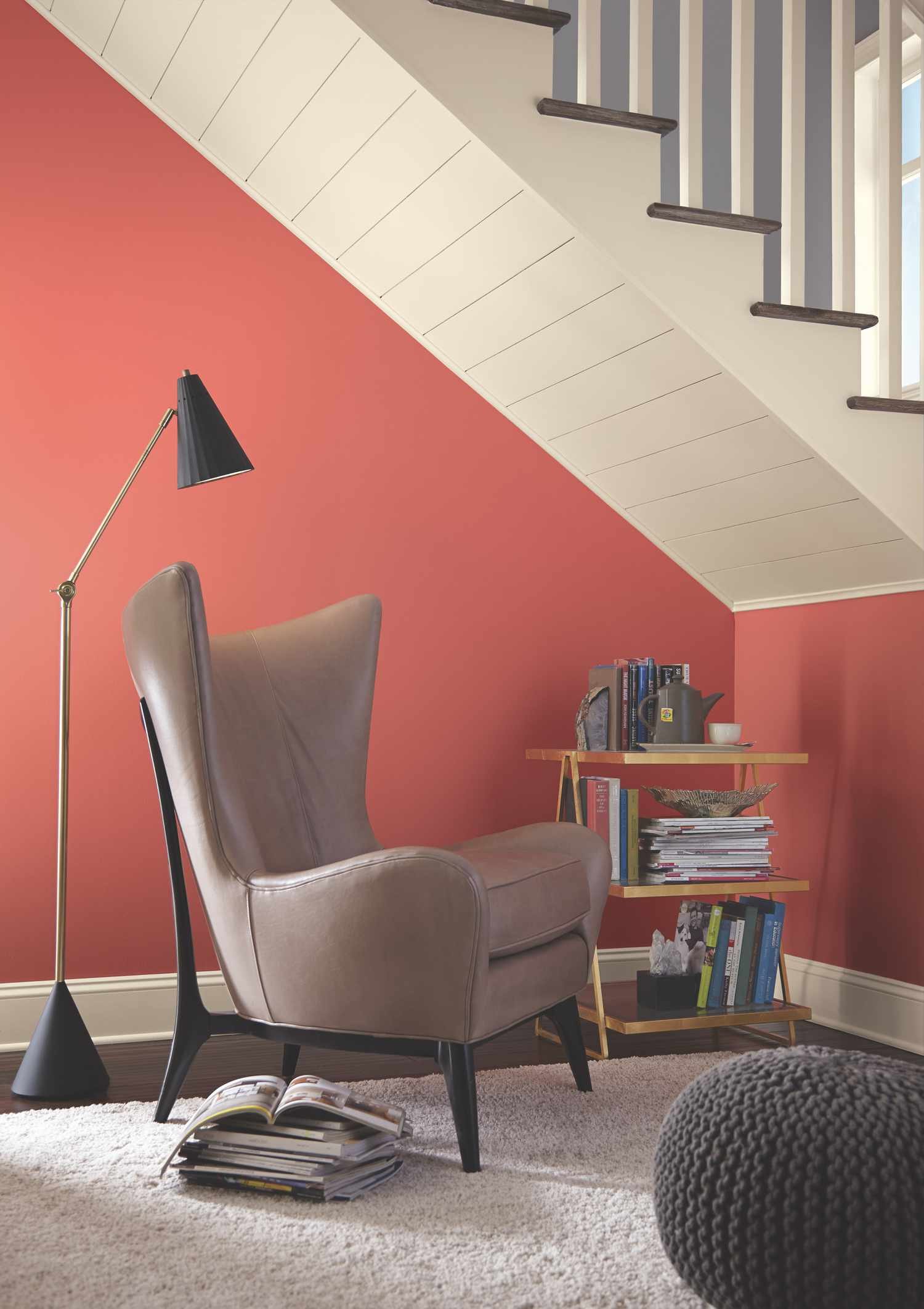
Credit:
This deeper shade of coral features warm red undertones that bring vibrancy and energy. As a result, it’s a popular choice for spaces such as living rooms, home offices, or powder bathrooms. Pair it with similarly warm-toned colors for a seamless finish.
-
20
of 20Behr King Salmon
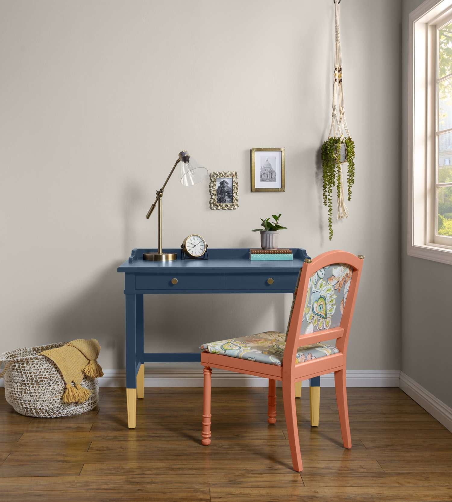
Credit:
Behr’s King Salmon is an earthy orange shade with warm pinky-red undertones. Admittedly, it’s on the edge of the coral spectrum, leaning close to terracotta, but is still counted thanks to its pinky-orange hue. This deeper shade of coral brings warmth and energy without being overpowering, making it ideal for a range of different spaces in the home.


